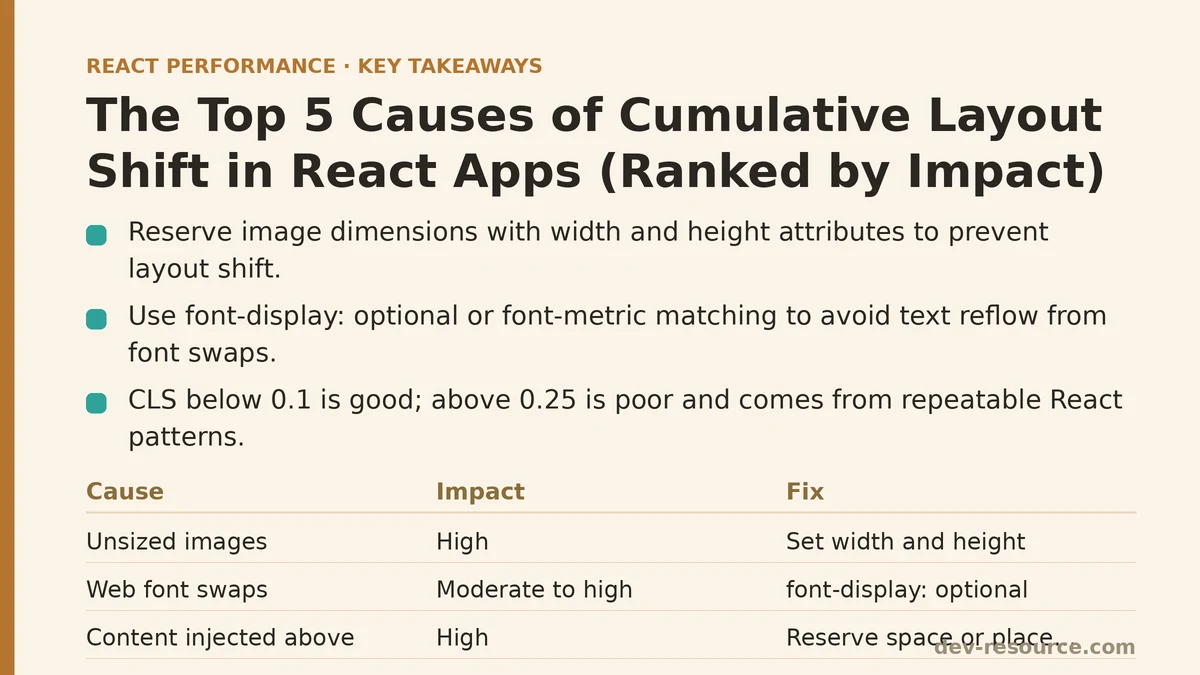
Cumulative Layout Shift (CLS) is a Core Web Vitals metric that quantifies how much visible content moves around on a page after it has already rendered. Each unexpected shift is scored based on the size of the element that moved and the distance it traveled, and those individual scores accumulate across the page’s lifetime into a single number. A score under 0.1 is considered good; anything above 0.25 is classified as poor. In React apps specifically, CLS tends to come from a small, repeatable set of causes tied to how components mount, fetch data, and render conditionally — not from anything exotic.
This post ranks the five most common sources of layout shift in React applications, from the biggest offenders to the more minor ones, based on how frequently they show up in Lighthouse audits and how much shift score they typically contribute per occurrence.
1. Images and Media Without Reserved Dimensions
This is consistently the largest single contributor to CLS in content-heavy React apps, and it’s also the easiest one to fix once identified. When an <img> tag has no width and height attributes (or equivalent CSS), the browser has no way to know how much vertical space to allocate before the file finishes downloading. The moment it arrives, everything below it gets pushed down — a classic, highly visible shift.
// Causes layout shift: no dimensions reserved
function ProductImage({ src, alt }) {
  return <img src={src} alt={alt} />;
}
The fix requires almost no additional code:
// Space is reserved before the image loads
function ProductImage({ src, alt }) {
  return <img src={src} alt={alt} width="400" height="300" />;
}
Specifying explicit dimensions lets the browser calculate the correct aspect ratio and reserve the box before a single byte of the image arrives. If the rendered size needs to scale responsively, pairing this with a CSS rule like img { height: auto; } preserves the ratio without reintroducing shift. For teams using next/image, this behavior is handled automatically — the component requires width and height (or the fill prop) as a condition of use, which is precisely why it tends to produce near-zero CLS scores out of the box.
Typical impact: high. A single unsized hero image can single-handedly push a page’s CLS score from “good” into “needs improvement.”
2. Web Fonts Swapping After Initial Render
Custom fonts loaded via @font-face or a service like Google Fonts create a well-known problem: the browser renders text in a fallback system font first, then swaps to the custom font once it downloads. If the two fonts have different metrics — different average character widths, different line heights — the swap reflows every line of text on the page. This is often called “flash of unstyled text” (FOUT), and it’s a frequent, underestimated contributor to CLS because the shift is small per line but multiplied across an entire page of body copy.
Two complementary fixes handle most cases. The first is a font-display strategy that minimizes the visible swap:
@font-face {
  font-family: 'CustomFont';
  src: url('/fonts/custom-font.woff2') format('woff2');
  font-display: optional;
}
font-display: optional tells the browser to use the fallback font permanently if the custom font doesn’t arrive within a very short window, avoiding the swap entirely on slower connections. The second fix is font-metric matching — using a tool to generate a fallback font with adjusted ascent-override, descent-override, and size-adjust values that closely match the custom font’s dimensions, so that even when a swap does happen, no reflow occurs because the two fonts occupy the same space.
Typical impact: moderate to high, particularly on text-heavy pages like blog posts or documentation sites.
3. Content Injected Above Existing Elements
This pattern shows up constantly in React apps that render banners, notifications, or promotional content conditionally, based on a state value that resolves after the initial render. A cookie consent banner, an A/B test variant, or a “you have 3 new messages” notice that gets inserted above the main content pushes everything below it down the moment it appears.
// Shifts content down once the banner condition resolves
function Page() {
  const [showBanner, setShowBanner] = useState(false);

  useEffect(() => {
    checkPromoEligibility().then(setShowBanner);
  }, []);

  return (
    <div>
      {showBanner && <PromoBanner />}
      <MainContent />
    </div>
  );
}
The most reliable fix is reserving space for the banner’s slot regardless of whether it ends up populated, using a fixed-height container with a placeholder state:
function Page() {
  const [showBanner, setShowBanner] = useState(null); // null = unresolved

  useEffect(() => {
    checkPromoEligibility().then(setShowBanner);
  }, []);

  return (
    <div>
      <div style={{ minHeight: showBanner === null ? '60px' : 'auto' }}>
        {showBanner && <PromoBanner />}
      </div>
      <MainContent />
    </div>
  );
}
An alternative worth considering: rendering this kind of content in an overlay or fixed-position element instead of inline, so its appearance never affects the document flow at all. Not every banner needs to live in the flow of the page.
Typical impact: moderate, but highly visible to users since it happens above the fold, often while they’re actively trying to read or click something.
4. Skeleton Screens With Mismatched Dimensions
Skeleton loaders are supposed to prevent layout shift, not cause it — but a mismatch between the skeleton’s dimensions and the real content’s dimensions produces exactly the shift the skeleton was meant to avoid. This is a subtler entry on this list because the code looks correct at a glance; the problem only surfaces when comparing the skeleton’s rendered height against the actual content’s height once data arrives.
// The skeleton height doesn't match the real card height
function ProductCard({ product }) {
  if (!product) {
    return <div className="skeleton" style={{ height: '150px' }} />;
  }
  return <div className="card" style={{ minHeight: '220px' }}>{/* content */}</div>;
}
A 70px discrepancy repeated across a grid of a dozen cards compounds quickly. Fixing this means measuring the actual rendered height of the populated component — using browser DevTools or a simple audit pass — and setting the skeleton’s height to match exactly, ideally by sharing a single height value between both states rather than hardcoding it twice:
const CARD_HEIGHT = 220;

function ProductCard({ product }) {
  if (!product) {
    return <div className="skeleton" style={{ height: CARD_HEIGHT }} />;
  }
  return <div className="card" style={{ minHeight: CARD_HEIGHT }}>{/* content */}</div>;
}
Typical impact: low to moderate per instance, but it scales with the number of skeleton elements on the page — a list or grid view can accumulate a surprising amount of shift from this alone.
5. Dynamically Injected Ads and Third-Party Embeds
Ranked last not because it’s rare, but because it’s often the hardest to control directly — the shift originates from a third-party script, not from application code. Ad slots, embedded tweets, and video players frequently resolve their final dimensions only after their own JavaScript executes, which can happen well after the surrounding React content has already settled into place.
The available fix is a container-based one: wrap the embed in an element with a fixed or aspect-ratio-based size, matching the third party’s documented dimensions as closely as possible.
function AdSlot() {
  return (
    <div style={{ minHeight: '250px', width: '300px' }}>
      <div id="ad-container-1" />
    </div>
  );
}
For embeds with a known aspect ratio, such as video, CSS aspect-ratio is often a cleaner solution than a fixed pixel height, since it adapts to different container widths without reintroducing shift:
.video-embed {
  aspect-ratio: 16 / 9;
  width: 100%;
}
Even with these mitigations in place, some shift from third-party content may be unavoidable if the provider doesn’t document consistent dimensions. In those cases, the goal shifts from elimination to minimization — reserving as close an approximation of the final size as the available information allows.
Typical impact: variable, ranging from negligible to severe depending entirely on the third party’s own behavior and how much control the container markup provides.
Ranked Summary
| Rank | Cause | Typical Impact | Primary Fix |
|---|---|---|---|
| 1 | Unsized images and media | High | Explicit width/height or next/image |
| 2 | Web font swapping | Moderate–High | font-display: optional + metric-matched fallback |
| 3 | Content injected above existing elements | Moderate | Reserve space or move content out of flow |
| 4 | Mismatched skeleton dimensions | Low–Moderate | Share a single height value between states |
| 5 | Third-party ads and embeds | Variable | Fixed or aspect-ratio-based containers |
Measuring CLS after each individual fix, rather than applying all five at once, makes it possible to see which of these was actually responsible for the bulk of a given page’s score — the ranking above reflects general frequency across audited React apps, but any single site’s worst offender may not match this order exactly. Run a Lighthouse pass, apply one fix, and re-measure before moving to the next.
Related guides: Web Vitals Optimization for React SPAs: A Step-by-Step Guide, Lazy Loading Third-Party Scripts in React Apps: 5 Techniques Ranked by Impact, and Fixing INP in React: 5 Interaction Delays Ranked by Impact.
🔗 Recommended Reading
- React Performance Mistakes in Fintech Dashboards and How to Fix Them
- Lazy Loading Images and Components in React: A Step-by-Step Tutorial
- React Memoization: When and How to Use memo, useMemo, and useCallback
- Next.js App Router Performance Optimization for Beginners: A Step-by-Step Guide
- Measuring and Fixing React Re-render Performance: A Step-by-Step Walkthrough